


![]()
Lil Farm Life was Playdom's main entry in the popular farming game genre on Facebook. As it is now defunct, I can neither demonstrate the game itself nor take any new screen shots to demonstrate my work on the game (the reworked photo system with viewfinder interface and improved user experience, revamped menus, revamped callouts, etc.). I remain undaunted, though. What I would like to do is share some screen shots of the old system—taken on February 17, 2010—and describe some of the changes I implemented and my reasoning for doing so. Let's start with a look at the original picture-taking interface, shall we?
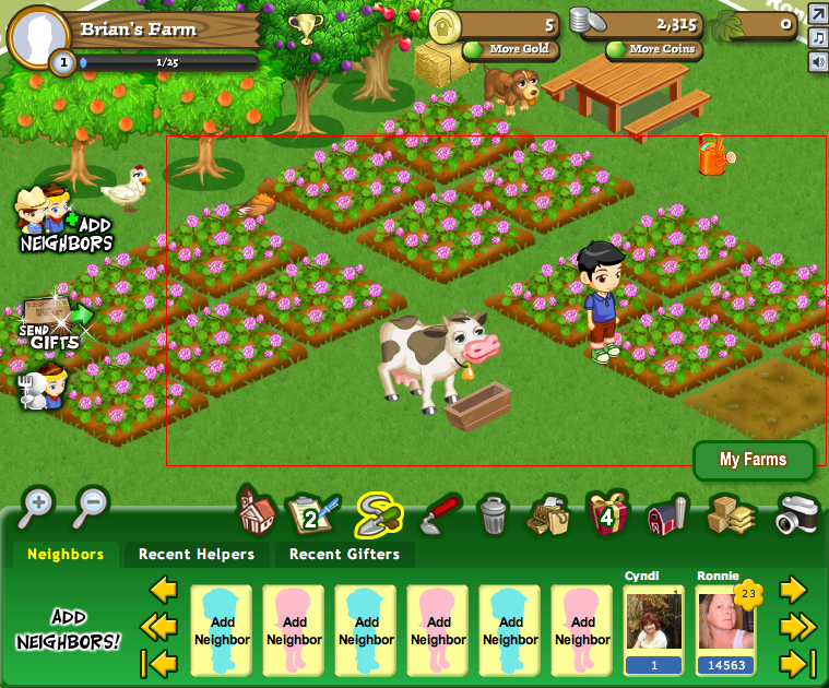
There's a lot going on there, so I can't blame you if you don't immediately understand the purpose of the red rectangle. That's what passed for a viewfinder when I joined the Lil Farm Life team. In addition to not providing much in the way of reinforcement of its purpose, it's horribly cramped by all of the other UI elements! Notice how its lower right corner is actually overlapped by the "My Farms" button. What you can't tell from still screens is that the rectangle jumped all over the place as well; it was horribly erratic.
It gets worse too. Here's another screen shot of the photo rectangle:

Note that in this second screen shot, the cow's feeding trough is highlighted and tip text appears above her. The game has detected my mouse position and responded as though I may want to interact with the cow even though I am clearly trying to take a photo of her—not feed her. The UI is confused and rightly so: the developers told it to do too much at once.
Before we move on to how I addressed this UI nightmare, I should mention the reason I was brought onto the Lil Farm Life team in the first place. I had been getting up to speed with the Tiki Farm team in the same building when it was brought to my attention that the Lil Farm Life team wanted to start purging Flex components from their game—replacing them with faster and lighter custom UI elements—and that my particular skills and experience could be better utilized by the other team. I was quickly moved over and set to work on the Lil Farm Life UI—mostly as a programmer, tasked with replacing Flex components with a mix of simple custom equivalents and prettier elements as they trickled in from an artist and UI designer.
When I joined the Lil Farm Life team, I quickly disliked both the picture-taking UI and the corresponding permission flow, but there didn't seem to be any plans to improve either, so I asked if I could take these things upon myself and I was told that I could, so I changed both drastically, which in turn changed the overall picture-taking experience drastically.
First off, as I described and showed above, the UI was horribly broken. I wanted to address the conflicts of space, the glitchy behavior, the visual clarity of purpose, and the quality of the overall look and feel. I did so by extending the camera metaphor of the icon to the interface itself. What do you see when you look into a camera's viewfinder? Compositional lines and circles surrounded by darkness. Certainly not icons for sending virtual gifts, buttons for buying virtual currency, outlines around object, or text floating in the air, so I got rid of all of that. I also dimmed the screen around the viewfinder (translucent rather than fully black to ensure usability), added compositional marks, and added minor instructional text. When I was done, there was a dedicated viewfinder interface with a clear purpose, pleasing and metaphorically consistent aesthetics, and no spatial competition or conflicts with unrelated UI elements.
That was only part of the job of revamping the photo-taking experience, though. The experience was also significantly hampered by an ill-timed permission prompt. While such a prompt may be necessary in the world of Facebook, it certainly isn't necessary to pester a user for permission to post a photo before the user has even taken a picture to post. It's absurd! It's annoying! And unfortunately, it's also how Lil Farm Life did things before I joined the team. I reworked the system so it would no longer bother a user for photo-posting permission until after the user had already taken a photo and confirmed that it was OK. Problem solved! The Social City team still went with a permission-first model, but the Lil Farm Life game designer and I both felt good about our improvements.
Here is a mock-up of my revamped photo interface, styled after a traditional camera viewfinder: